


SAVA
Client
MK "SAVA"
Services
Analytics
Package design
Honesty and taste
Task
Meat Processing Factory "SAVA" is a diversified enterprise that produces sausages and other delicacies. Products are sold in many Russian cities as well as in former Soviet Republics. Today, the main assortment line is degraded as there is no uniform style. Therefore, the product is not visible on the shelf. The brand was planning to enter the Central Federal District and we were tasked with the redesigning of a line of sausages with certified GOST (Certificate of Conformity Norms and Standards in Russia).


Product
The SAVA Products are manufactured in an ecologically clean area in compliance with all requirements of the Russian product certification GOST. The brand relies on an honest and clean composition without deviations or additives. The sausage has a high percentage of meat and a good taste.
Market and competitors:
1. GOST quality
Most competitors base their positioning on the quality of the Russian product certification GOST. A different strategy needed to be developed while maintaining the brand’s high quality direction.
2. Visual clichés
Competitors look the same: there is a legacy of redundant post-perestroika design and colour patterns including red, white, yellow and black hues.
Competitors look the same: there is a legacy of redundant post-perestroika design and colour patterns including red, white, yellow and black hues.
3. Decline in trust
Consumers are becoming more rational and start reading the product compositions more often. Deception by manufacturers has reduced brand credibility.
Consumers are becoming more rational and start reading the product compositions more often. Deception by manufacturers has reduced brand credibility.


Consumers
Our audience loves sausages. This product is an integral part of their breakfast and dinner. Sausages are a tasty and economical solution for a festive table. You may prepare salads, slide these delicacies to pamper yourself and enravish your guests.
The consumers are quite conservative in their choices. They are used to buying a particular brand because they trust its quality. Many factors are important to them: taste, colour, organoleptic properties of the product as well as the packaging.
Design
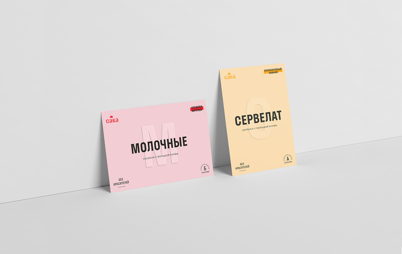
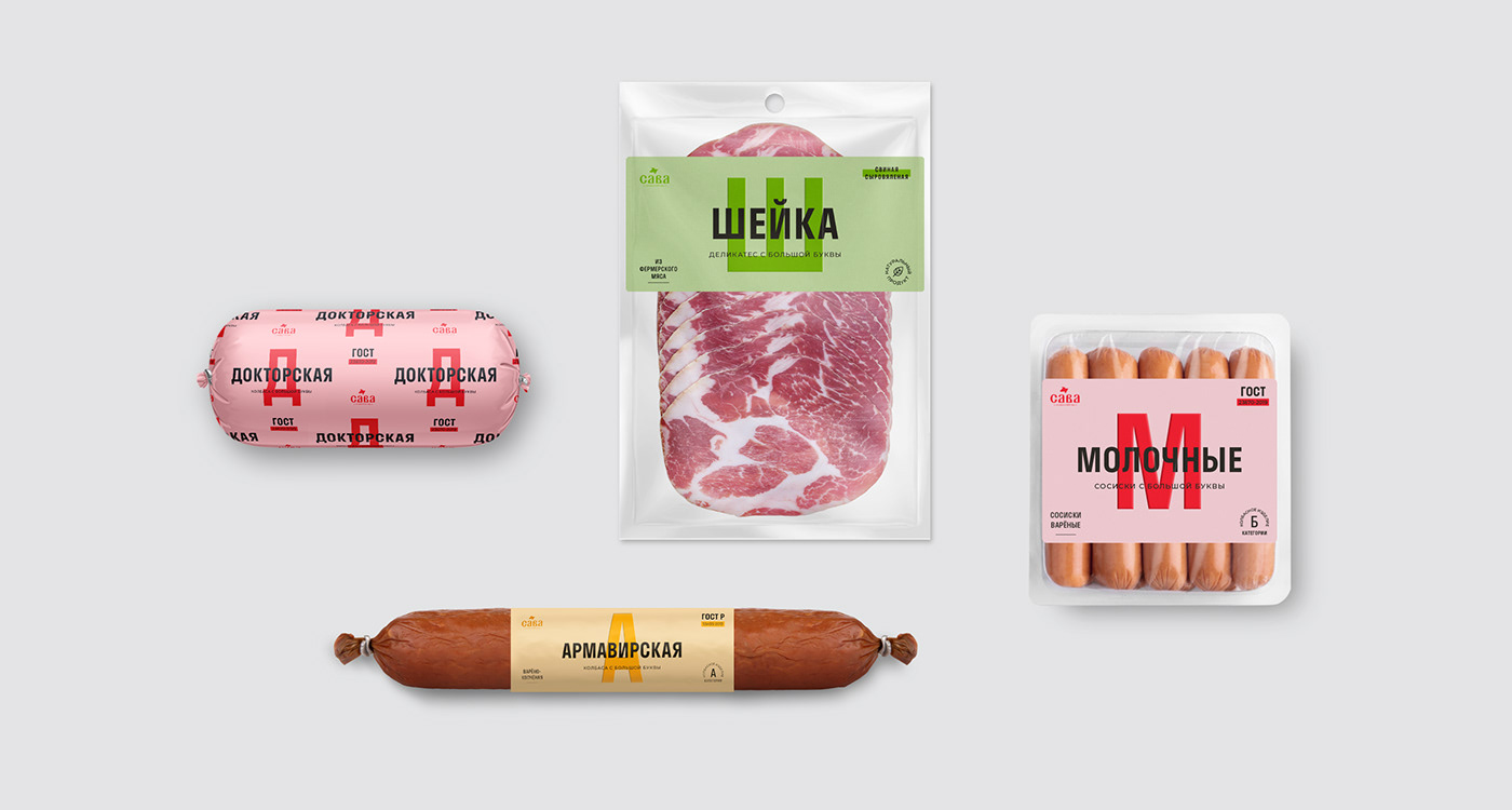
The label maintains the emphasis on the capital letter. We deliberately violated the former packaging arrangement by taking the logo aside. Thus, the brand emphasises that the most important thing for it is the product itself.
The label maintains the emphasis on the capital letter. We deliberately violated the former packaging arrangement by taking the logo aside. Thus, the brand emphasises that the most important thing for it is the product itself.


Pattern
The repetitive image pattern is used only for cooked sausages. Thus, the product stands out favorably among the competition, which allows us to remain on the shelf.
The repetitive image pattern is used only for cooked sausages. Thus, the product stands out favorably among the competition, which allows us to remain on the shelf.
For the line, juicy colors have been chosen. They reveal the taste of the products. The stock-keeping unit differentiation is carried out within the assortment line thanks to these colours.


Additional advertising media have also been developed. For B2B areas, we created a shipping box. It shapes the brand image in the eyes of partners: clean, simple and minimalistic. A large slogan is transmitted into brand positioning.
We have developed shelf talkers to communicate with the B2C audience. Thanks to them, the consumer makes their choice on the shelf faster. They focus on the delicious food zone of ready-made meals from the SAVA brand and key slogans that reflect the values.
The updated line of GOST sausages of the SAVA brand looks fresh, modern and clean. The key message about the purity of the composition is fully conveyed in the design. The product can already be found on store shelves.


